We’ve all been there. You open your email, download the PDF containing your latest blood test results, and instantly feel like you’re trying to read a foreign language.
Rows of cryptic abbreviations like MCV, HbA1c, and HDL, followed by columns of decimals, reference ranges, and the occasional alarming "HIGH" or "LOW" printed in bold text.
Naturally, you copy-paste the confusing terms into a search engine, only to end up more anxious than when you started.
But taking care of your health shouldn’t require a medical degree. Understanding your blood test report is simply a matter of knowing what to look for. Here is a quick, plain-English guide to decoding your biomarkers online—and how you can visualize the whole picture instantly.
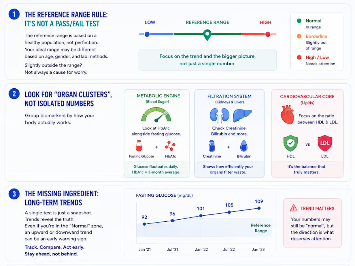
1. The Reference Range Rule: It’s Not a Pass/Fail Test
The most common mistake people make is looking at a baseline reference range as a strict boundary for perfect health.
A reference range is simply the upper and lower limits based on a sample population of healthy individuals.
If your number sits slightly outside that boundary, it doesn't automatically mean something is wrong. Reference ranges can shift depending on your age, gender, and even the specific equipment a particular lab uses. A slight variation is often just your body's unique baseline.
2. Look for "Organ Clusters," Not Isolated Numbers
Traditional lab reports list tests alphabetically or by the raw machinery that processed them. This completely masks how your body actually works.
To get a true snapshot of your wellness, you need to group individual biomarkers into their respective organ teams:
- Your Metabolic Engine (Blood Sugar): Look at your HbA1c alongside fasting glucose. While daily glucose bounces around based on your last meal, HbA1c gives you a rock-solid, 3-month average of your blood sugar health.
- Your Filtration System (Kidneys & Liver): Biomarkers like Creatinine and Bilirubin tell you how efficiently your vital organs are filtering out waste.
- Your Cardiovascular Core (Lipids): Instead of just looking at "Total Cholesterol," focus on the ratio between HDL (the protective cholesterol) and LDL (the one to keep an eye on).
3. The Missing Ingredient: Long-Term Trends
A single blood test is just a snapshot of a single morning. The real magic happens when you look at the trajectory.
Is your fasting glucose slowly climbing over the last three years, even if it’s technically still in the "Normal" zone? That upward trend is an incredibly valuable early warning sign that gives you the power to adjust your lifestyle long before a chronic condition develops.
The Smarter Way: Decode Your Report Instantly
If you don't want to spend hours manually plotting graphs or translating medical jargon, you don't have to.
We built niro.health to act as your personal, automated lab report analyzer.
Instead of squinting at a confusing, black-and-white PDF table, you can upload your digital report from any diagnostic provider directly into our secure platform. Our engine instantly transforms raw numbers into:
- Intuitive Visual Summaries: Clear, color-coded graphs that tell you exactly where you stand.
- Organ-Wise Explanations: Deep insights into how your liver, kidneys, and heart are performing.
- Automated Longitudinal Tracking: A continuous timeline that maps your past records against your current data so you can see your health journey evolve over time.
Your health data belongs to you—it’s time you actually understood what it’s trying to tell you.
Drop your latest PDF at niro.health and see your numbers come to life for free.