Author: Joyneel Acharya
Last Updated on: 9th September 2025
Key Takeaways
- Mobile-friendly web design ensures health reports are accessible, clear, and usable across all devices, improving patient and provider engagement.
- Responsive design enhances readability, navigation, and compliance with accessibility standards, crucial for diverse users including seniors and those with disabilities.
- The growing mHealth market demands seamless mobile experiences for quick access to critical health data and real-time clinical decision-making.
- Effective UI/UX design in mobile health apps focuses on simple navigation, readable typography, personalization, and real-time feedback to improve user confidence and satisfaction.
- Key UI/UX principles for health reports include clarity, simplicity, accessible design, consistent navigation, personalization, and strong privacy and security measures.
The Growing Importance of Mobile Friendly Design in Healthcare
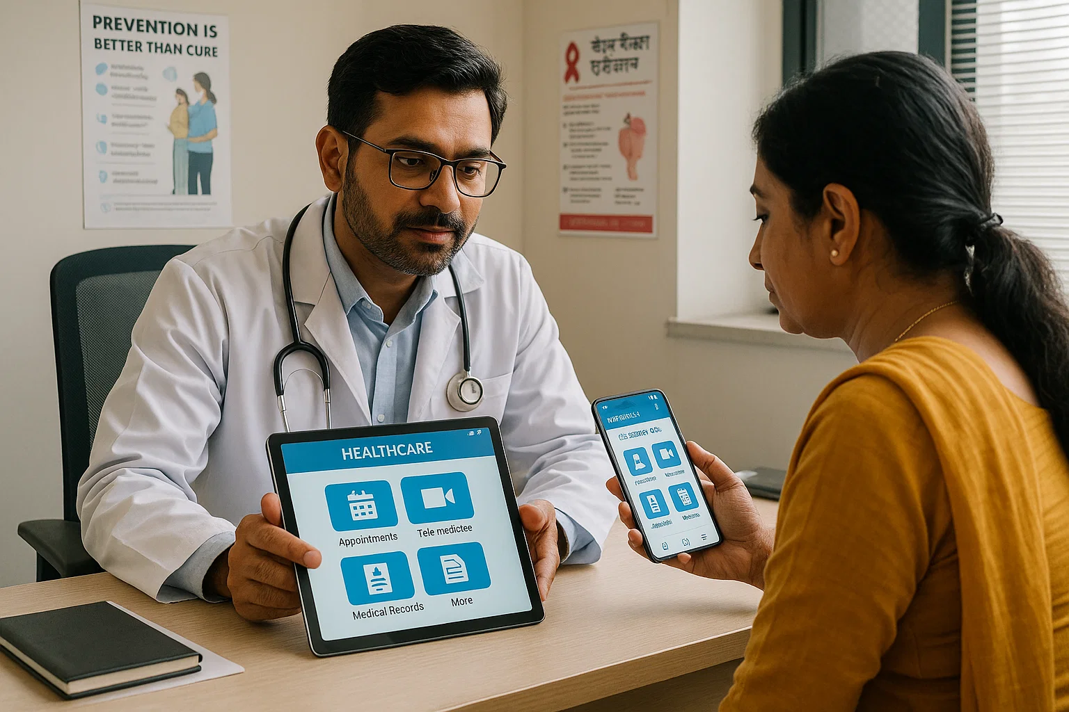
Healthcare administrators often struggle with the dual challenge of improving patient engagement while managing operational efficiency. In today's digital-first world, a significant part of this challenge lies in how patients and providers interact with health information. The rising trend of mobile usage for accessing health data isn't just a consumer preference; it's a fundamental shift in healthcare delivery. With the mHealth apps market projected to more than double by 2030, a mobile friendly web presence is no longer optional-it's a necessity for any modern healthcare organisation.
Patients now expect immediate, clear access to their health data anytime, anywhere, while clinicians depend on mobile tools for real-time, on-the-go decision-making. A non-optimised mobile experience can lead to frustrated patients, disengaged providers, and administrative bottlenecks. That's why we developed NirogGyan's Smart Reports- a solution designed to bridge this gap by ensuring critical health information is seamlessly accessible on any device, directly addressing the core need for efficient and effective digital communication in healthcare.
How UI/UX Design Enhances User Experience in Mobile Health Apps
Effective UI/UX design for mobile apps is the cornerstone of a successful digital health strategy. It’s not just about aesthetics; it's about making complex medical information intuitive, accessible, and engaging for both patients and providers. For health report users, who may be anxious or have low health literacy, the quality of the user experience can directly impact their understanding and adherence to care plans.
A well-designed mobile UI and UX reduces cognitive load, allowing users to find and comprehend vital health information quickly. Key elements like simple navigation, readable typography, and personalised content build user confidence and satisfaction. For instance, presenting complex lab results with calming colours and large, legible fonts can significantly ease patient anxiety and improve comprehension. This focus on user-centric design is what transforms a simple mobile app into a powerful tool for patient empowerment and clinical efficiency.
Key Principles of Mobile UI/UX Design for Health Reports
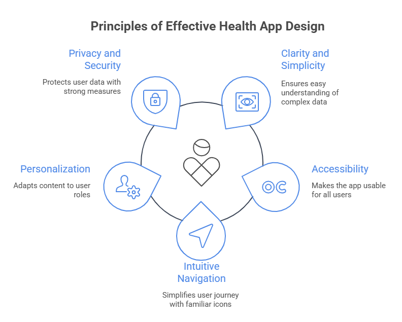
Delivering high-quality healthcare information on a small screen requires a disciplined approach to UI/UX design. Healthcare administrators know that a confusing interface can lead to missed appointments, medication errors, and an influx of support calls. To avoid this, NirogGyan’s health app design is built on several key principles:
- Clarity and Simplicity: We prioritise readable typography, high colour contrast, and a logical visual hierarchy to ensure users can interpret complex medical data without feeling overwhelmed.
- Accessibility: Our designs adhere to Web Content Accessibility Guidelines (WCAG) standards to ensure that users with disabilities, including visual impairments or motor challenges, can navigate their health reports effectively. This is crucial for serving diverse patient populations, including seniors.
- Intuitive & Consistent Navigation: By using familiar icons and predictable layouts, we reduce the learning curve and cognitive load, making the user journey seamless and efficient.
- Personalisation: The interface and content adapt based on the user's role whether they are a patient, caregiver, or healthcare provider ensuring the information presented is always relevant.
- Privacy and Security: In healthcare, trust is paramount. We clearly communicate our robust data protection measures, including adherence to relevant privacy regulations and the use of strong encryption, to build and maintain user trust.
Key Takeaway: A strong foundation in mobile UI/UX principles isn't a technical detail, it's a core component of patient safety, engagement, and operational success. By prioritising clarity, accessibility, and security, healthcare providers can build digital tools that patients and clinicians trust and use effectively.
Optimizing Health Data Visualization for Mobile Devices
Presenting complex lab results, trend data, and medical histories on a mobile screen is a significant operational challenge. Dense tables and complicated graphs often render poorly on mobile devices, leading to misinterpretation and patient confusion. Health data visualization optimised for mobile transforms this raw data into clear, actionable insights.
NirogGyan's approach focuses on simplicity and interactivity. We use concise charts, high-contrast colours, and large, touch-friendly targets to enhance readability and usability on any screen size. Interactive elements, such as tap-to-expand details or gesture controls for zooming, allow users to explore their data without cluttering the interface. For example, a patient tracking their blood glucose levels can see a simple line chart with touch-enabled data points, allowing them to quickly identify patterns and share them with their provider.
Common Challenges in Mobile Health Report Design and How to Overcome Them
Healthcare administrators are rightfully concerned about the practical hurdles of implementing new digital health solutions. The path is often fraught with challenges related to screen space, data complexity, security, and regulatory compliance.
| Common Challenge | Operational Impact | NirogGyan's Strategic Solution |
| Limited Screen Space | Overwhelmed users, critical data missed, increased support calls. | We employ minimalist layouts with expandable sections, prioritising the most critical information upfront while keeping deeper data accessible. |
| Data Complexity | Patient anxiety, misinterpretation of results, poor adherence to treatment plans. | Our platform uses adaptive interfaces tailored to different user roles and health literacy levels, simplifying medical jargon and visualising data for clarity. |
| Regulatory Compliance | Risk of fines, data breaches, loss of patient trust. | We design for compliance with telemedicine guidelines and data privacy regulations, implementing strong encryption and transparent policies to protect sensitive health information. |
| Data Interoperability | Fragmented patient view, inefficient workflows for clinicians. | We utilise standardised data formats and integrate APIs for seamless data exchange with Electronic Health Records (EHRs) and other clinical systems, creating a unified view of patient data. |
Addressing these pain points head-on improves usability, builds trust, and drives meaningful engagement in mobile health reporting.
The Impact of Mobile Friendly Design on Patient Engagement and Outcomes
The ROI of a superior user experience becomes clear when you consider its direct impact on patient behaviour and health outcomes. A mobile-friendly design makes healthcare interactions more accessible and less intimidating, which significantly boosts patient engagement. When patients can effortlessly navigate their health portal on a phone, they are more likely to review test results, adhere to treatment plans, and communicate with their providers.
Key Impacts on Outcomes and ROI:
- Increased Adherence: Clear information and timely notifications lead to better medication and appointment follow-up, which is critical for managing chronic conditions.
- Enhanced Patient Understanding: Simplifying complex data through intuitive interfaces reduces patient anxiety and empowers them to take a more active role in their care.
- Improved Communication: Seamless messaging and data sharing strengthen the provider-patient relationship and support timely interventions.
- Reduced Administrative Load: An intuitive portal that answers common patient questions proactively can reduce call centre volume and free up staff for higher-value tasks.
A mobile-optimised patient portal that sends appointment reminders is a perfect example of a small feature with a large impact, improving care continuity and reducing costly no-shows.
Best Practices and Tools for Mobile Health App Development
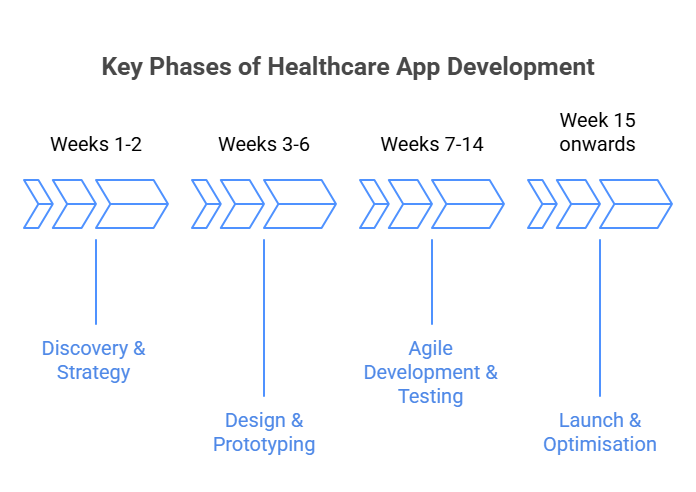
Successfully developing a mobile health app requires more than just good code; it demands a user-centric methodology and the right tools. That's why we advocate for an integrated approach from day one.
Practical Implementation Guide:
- Phase 1: Discovery & Strategy (Weeks 1-2): Engage a multidisciplinary team of UX designers, developers, and healthcare experts to define user needs (for both patients and providers) and establish clear goals.
- Phase 2: Design & Prototyping (Weeks 3-6): Use collaborative tools like Figma to create and iterate on UI/UX designs. Develop interactive prototypes with tools like UXPin to simulate complex healthcare workflows and gather early feedback.
- Phase 3: Agile Development & Testing (Weeks 7-14): Employ agile development sprints for iterative building and testing. Use tools like Zeplin to ensure a seamless handoff from design to development, maintaining pixel-perfect precision.
- Phase 4: Launch & Optimisation (Week 15 onwards): Deploy the application and continuously monitor user feedback and analytics to make data-driven improvements.
Feature Comparison: In-House vs. NirogGyan's Platform
| Feature | Typical In-House Development | NirogGyan's Solution |
| Speed to Market | 6-12+ months | Weeks |
| Compliance | Requires dedicated legal/compliance team | Built-in adherence to key regulations |
| UI/UX Expertise | Requires hiring specialised designers | Pre-built, clinically validated, and user-tested templates |
| Interoperability | Custom API integrations required | Standardised APIs for seamless EHR integration |
| Upfront Cost | High (salaries, tools, infrastructure) | Lower (subscription or licensing model) |
By leveraging proven tools and methodologies, healthcare organisations can accelerate development, reduce errors, and deliver a superior mobile health experience.
Conclusion: Embracing Mobile Friendly UI/UX for Effective Health Reporting
In conclusion, embracing a mobile friendly web and UI/UX strategy is no longer a choice but a strategic imperative for effective health reporting. Healthcare administrators who prioritise simplicity, personalisation, and secure design will empower both patients and providers, turning complex data into actionable insights on any device. This approach doesn't just improve the user experience; it strengthens patient communication, boosts treatment adherence, and ultimately drives better health outcomes. A well-designed mobile health report allows a patient to effortlessly track their progress and make informed decisions, which is the cornerstone of modern, patient-centred care.
Frequently asked questions (FAQs)
1. Why is mobile-friendly design important for health reports?
Mobile-friendly design ensures health reports are clear, accessible, and usable across devices, helping patients and providers quickly view critical data and improving overall healthcare engagement.
2. How does UI/UX design improve mobile health apps?
Good UI/UX design in health apps simplifies navigation, enhances readability, and personalizes data, making it easier for users to understand medical reports and follow treatment plans.
3. What are the key principles of mobile health report design?
Key principles include clarity, accessibility, consistent navigation, personalization, and strong privacy/security to ensure patients and providers can trust and easily use health data on mobile devices.
4. What challenges exist in mobile health report design?
Common challenges include balancing detail with simplicity, ensuring data privacy and HIPAA compliance, and designing for diverse users. These can be solved with minimal layouts, adaptive interfaces, and encryption.
5. How does mobile-friendly design impact patient outcomes?
Mobile-optimized health reports improve patient engagement, treatment adherence, and communication with providers, leading to better chronic disease management and overall healthcare outcomes.
“Access your health reports anytime, anywhere with NirogGyan’s mobile-friendly design - simple, secure, and built for better patient experience.”